Year-on-year we see a shift in color trends – from Pantone’s color of the year, popular event themes with strong color elements, to cutting-edge lighting technology.
We love to play with color as it is an important tool used to set the tone and mood of any space and event. One thing that never changes is the fact that a well-chosen event design can shape the experience a Guest will have at your event.
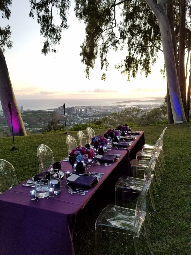
Never short of incredible outdoor locations here in Hawai’i, we often draw our inspiration from them as a starting point when designing. The natural beauty and abundance of green and blue makes it easy to incorporate pops of colors that make an impact without overwhelming the space.
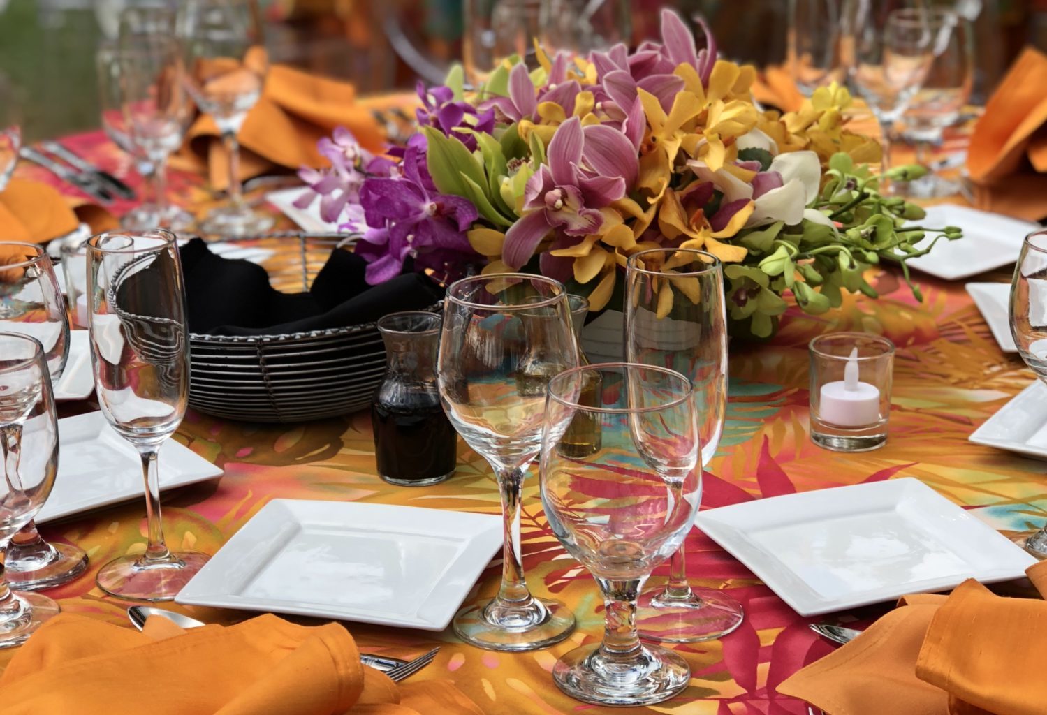
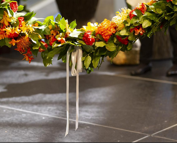
Pantone’s 2019 Color of the Year Living Coral may not be for you, but orange is a timeless favorite of ours as it is neither too masculine nor too feminine and evokes the ideals of playfulness, enthusiasm and creativity. In addition, our destination offers a variety of floral choices in multiple shades of orange so Clients can easily tie in a touch of Hawaii and color to their design.
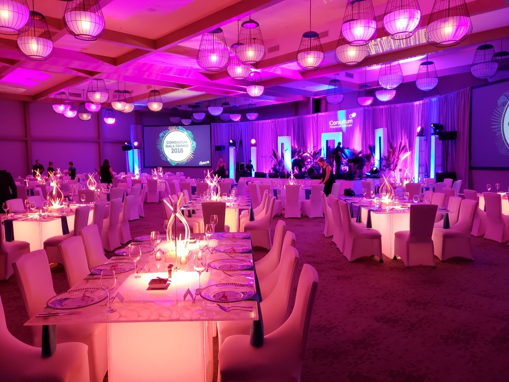
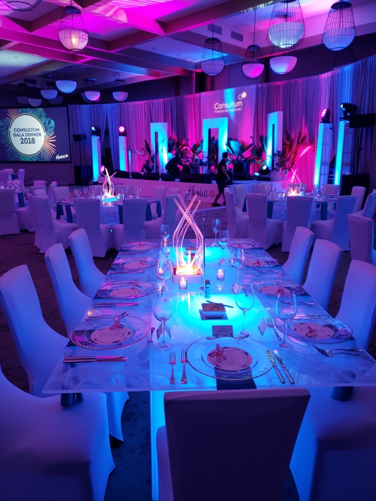
Lighting can transform a space and allows us to use color to create contrast in out-of-the-box ways. With today’s ever-expanding technology, color not only becomes part of the design but part of the entertainment. At a recent event, the lighting in our furniture changed colors in sync to the beat of the music.
Our final recommendation: Just say yes to color! With the right design, there are many creative ways to pull in color and use contrast to create a dynamic and unforgettable experience.

LINDSAY CASTRO
SALES MANAGER
If you’d like to hear more about color and contrast, or need support with your upcoming event, you can contact Lindsay and our Team by emailing us at Sales@current-Affairs.net

